-
January 6, 2025 at 7:10 pm #7522
 Bahadir TosunParticipant
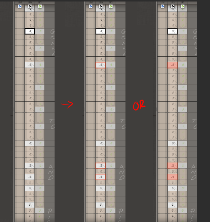
I’m not complaining; it is just my eyes, you know 🙂 It is hard to see key icons. May I suggest…?

Thanks
January 6, 2025 at 9:49 pm #7523 cevikParticipant
Interesting, it seems much bigger and visible on my Cintiq 22.
January 6, 2025 at 10:00 pm #7524 Bahadir TosunParticipant
I chose thumbnail tiny; I have better control of my keys and less scrolling, etc.
January 6, 2025 at 11:11 pm #7527 NielsKeymaster
Thanks both of you! Bahadir – as usual, you got a point. Noted!
January 14, 2025 at 1:39 pm #7576 NielsKeymaster
Hi Bahadir,
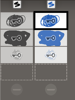
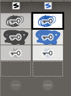
We have looked into the issue you brought up with the key-markings not visible enough. In that process we discovered that the key graphic we used was quite transparent, so with your small scale thumbs and naturally contrasty/noisy drawing behind it (as will be the case for many/most animators, I’m sure), the key symbol will almost disappear.
So we have made the key graphic a little larger, with a thicker white outline and solid opacity. It is much more visible now. So maybe we don’t need the colored frame anymore. What do you think?

 January 14, 2025 at 1:42 pm #7577
 NielsKeymaster
I understand that adding the change in color would make it even more obvious. However, I would rather not do it, because such colors also adds to the “noise” of the interface in general. I hope to keep everything as calm and uncluttered as possible – without sacrificing important information of course. I am awaiting your thoughts. Thank you Bahadir!
January 14, 2025 at 4:14 pm #7578 Bahadir TosunParticipant
At least can you change the color of the key (or the color of the boldline/contour around the key)? It could be the same color as the layer, maybe?
Thanks
You must be logged in to reply to this topic.
