• April 21, 2021 at 12:48 pm #3572
    Bob DelbridgeBob Delbridge
    Participant

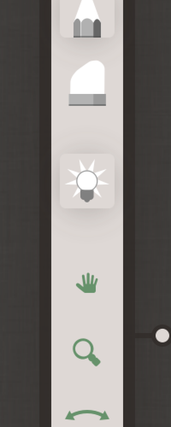
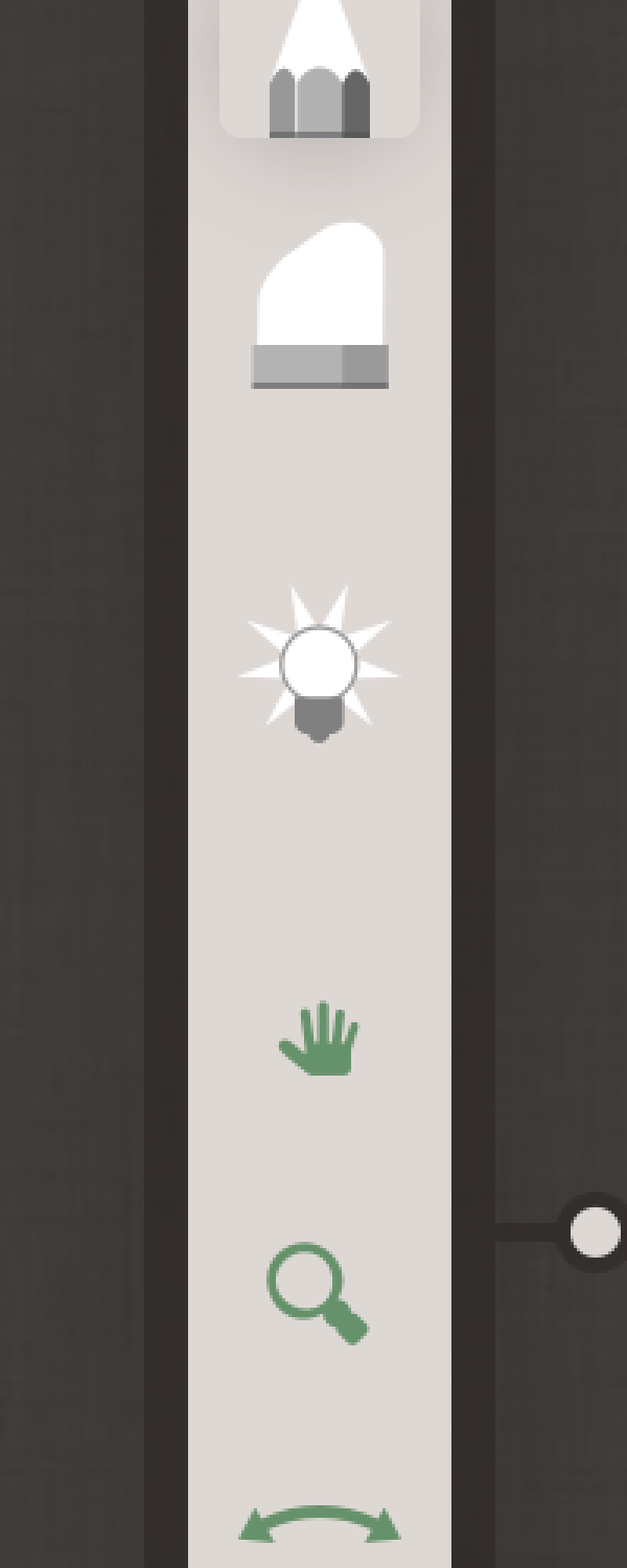
    The difference between on and off is not clear enough for me in the tool bar. Can I adjust this somehow?

    April 21, 2021 at 3:52 pm #3576
    Niels Krogh MortensenNiels
    Keymaster

    I guess depending on your monitor and settings it could be hard to clearly see the difference. Maybe I made the difference to small?

    This is how it looks – light table off and on:
     

    We do not have any user settings for adjusting UI contrast or anything like that, sorry. Let me know if you think that would be necessary?

    Thanks,
    Niels

    • This reply was modified 3 years, 7 months ago by Niels.
    • This reply was modified 3 years, 7 months ago by Niels.
    May 6, 2021 at 12:18 pm #3609
    Hans Jacob WagnerHans Jacob Wagner
    Participant

    Maybe the bulb could turn on? The interface is nice!! But my eyes aren’t getting any better, so I too, think there’s room for a little adjustment.

    May 7, 2021 at 9:08 am #3617
    Niels Krogh MortensenNiels
    Keymaster

    OK, thanks Hans. That’s noted in my todolist. 😉

You must be logged in to reply to this topic.